|
|
Log In |
| Home | Forums | Shops | Trade | Avatar | Inbox | Games | Donate |
| Not Logged In |
 Trisphee
 |
|
|
Thread Tools |


It's okay-ish. Not a fan though 
7.5/10
7.5/10

^Toxxic art
art by chocobo & honey

 Posted 01-03-201309:56 AM


9 / 10
The white of the wings is really bright
compared to the white on the rest of the
avi and it looks a little weird.
Other then that, it's beautiful. * U*
The white of the wings is really bright
compared to the white on the rest of the
avi and it looks a little weird.
Other then that, it's beautiful. * U*
nighty's sig in under construction.
Posted 01-03-201312:20 PM


So plain to me. Needs more. And MORE AND MORE AND MORE. lol
I like cluttered avatars, though, soooo, I'm biased. OTL
3/10
I like cluttered avatars, though, soooo, I'm biased. OTL
3/10
 Posted 01-04-201308:21 PM
7 / 10
The green in the back bugs me a lot
since there's no green anywhere else.
The green in the back bugs me a lot
since there's no green anywhere else.
nighty's sig in under construction.
Posted 01-04-201310:57 PM
@Law:: You obviously don't know how to judge an avi. 
Nightmare's avi are always pretty~ I especially like the sky + gold + white combination, so 10/10 for me
Nightmare's avi are always pretty~ I especially like the sky + gold + white combination, so 10/10 for me
^Toxxic art
art by chocobo & honey
Posted 01-05-201304:38 AM

Lauv : awww, thanks. < 3
You always have pretty avis, too. >u <
Ben : 8 / 10
The random bits of red throw me off,
and I feel like there isn't enough
black, but it's a nice start.
You always have pretty avis, too. >u <
Ben : 8 / 10
The random bits of red throw me off,
and I feel like there isn't enough
black, but it's a nice start.
nighty's sig in under construction.
Posted 01-05-201301:54 PM

5/10
it would have been a seven for incompleteness but i saw asami's and she pulled it off beautifully so -3 for incompleteness and -2 for mediocre use of the color-theme
(also i look forward to my own bad review XD my rp chars usually get low scores and this one is the plainest by far hahahaha)
it would have been a seven for incompleteness but i saw asami's and she pulled it off beautifully so -3 for incompleteness and -2 for mediocre use of the color-theme
(also i look forward to my own bad review XD my rp chars usually get low scores and this one is the plainest by far hahahaha)
Posted 01-05-201302:17 PM
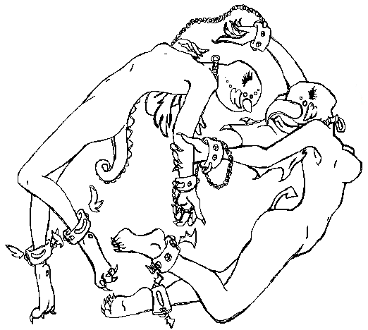
the only thing that makes it off is the floating tree
I like the whole thing though so, 8/10
I like the whole thing though so, 8/10
^Toxxic art
art by chocobo & honey
Posted 01-06-201305:45 AM
9.5 / 10
I love it, though I just wish it had some black shorts on. |D
I love it, though I just wish it had some black shorts on. |D
nighty's sig in under construction.
Posted 01-06-201304:09 PM
8/10 good use of color and the whole thing feels rather sharp oxo dun wnt to touch you just in case i cut myself
Posted 01-06-201304:13 PM
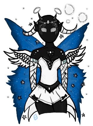
6 / 10 from the avatar perspective. I think it's missing something,
and it's really dark. The purple and light blue really catch my attention,
and the shirt is too bright.
8 / 10 from a character perspective. I think it would make for a great
character, expect for the wings. |D
and it's really dark. The purple and light blue really catch my attention,
and the shirt is too bright.
8 / 10 from a character perspective. I think it would make for a great
character, expect for the wings. |D
nighty's sig in under construction.
Posted 01-08-201307:12 PM
|
«
Previous Thread
|
Next Thread
»
| Currently Active Users Viewing This Thread: 1 (0 members and 1 guests) | |
| Thread Tools | |


|
|

All content is copyright © 2010 - 2026 Trisphee.com
FAQ | E-Mail | Terms of Service | Privacy Policy | Forum Rules
Twitter | Facebook | Tumblr
FAQ | E-Mail | Terms of Service | Privacy Policy | Forum Rules
Twitter | Facebook | Tumblr